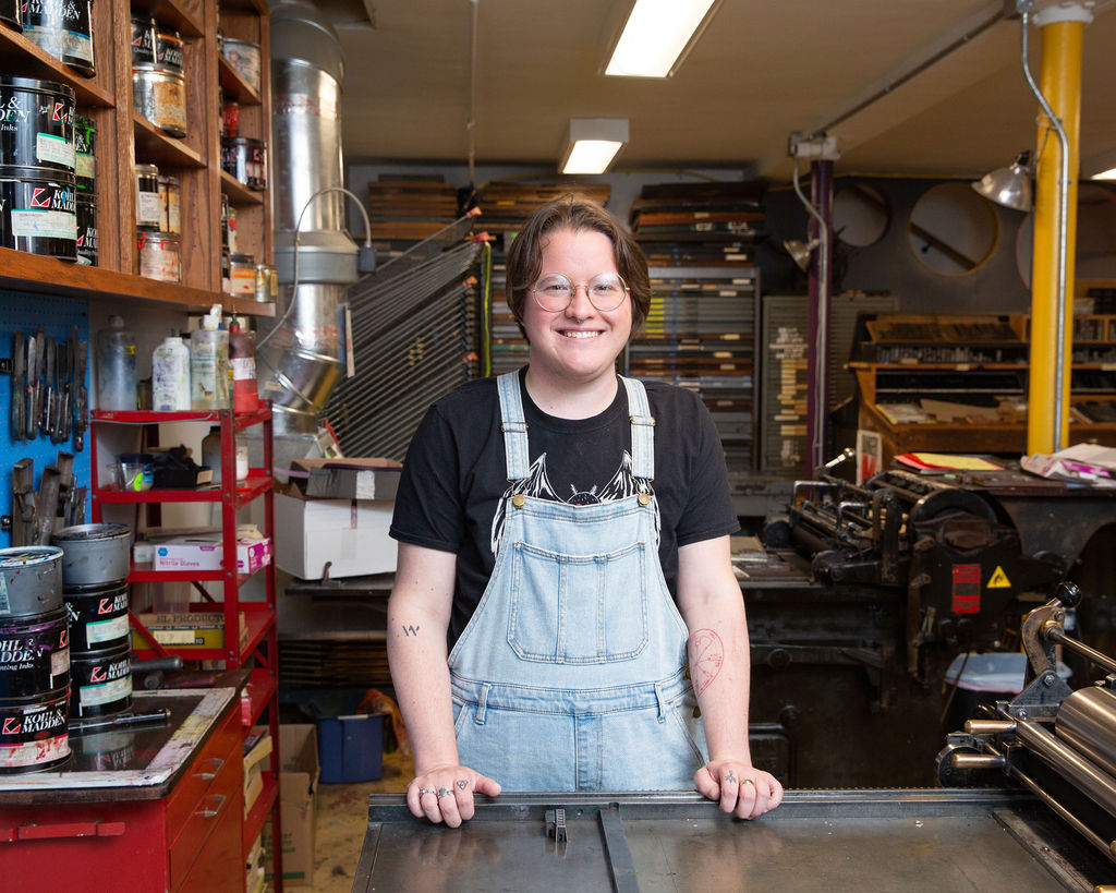
Finding Empowerment With New Work: A Conversation with Studio Resident Jameson Hampton
March 10, 2022 Jamey Alea 0 Comments
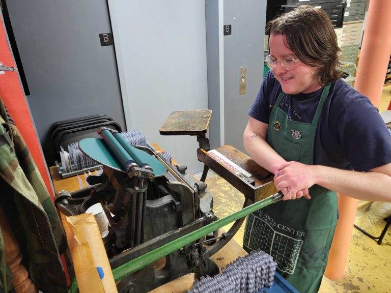
I have been hard at work on my letterpress residency project and the upcoming exhibition which opens at Book Arts next week! Here’s the description of the project:
The Tarot of Sorts is a collage-style tarot deck, inspired by the major arcana of the classic Rider-Waite-Smith deck, illustrated by Pamela Coleman Smith in 1909. By constraining the art to what is available on letterpress blocks, it explores the traditional symbolism of the tarot in a unique and minimalist way, getting at the heart of how divinatory meaning is conveyed. Magic is about intention and manifestation, and by hand-printing the deck, each card is imbued with magical intention, which leads to the manifestation of the project as a whole.
I had this great conversation about my project with Nina Grenga of Book Arts.
How were you introduced to Book Arts?
I studied digital art at Canisius College and I’ve been aware of Book Arts since then. I was never able to take a class here during college, but I did do a videography internship at Artvoice in 2012 and I covered the Small Press Book Fair, which was a fun connection! A lot of the art I studied in school was very high tech, but I’m really drawn to old forms of media because I like the idea of carrying on artistic traditions. So that led me originally to zines and I was the zine librarian at Sugar City for a while, and eventually it led me here to learn letterpress and that felt like a very natural progression for me.
The idea for these tarot cards was sparked in the summer of 2021, can you tell me about how your journey has been leading up to the completion of this collection?
Yes! I did the first three cards over the summer—the Moon, Justice and the Hermit were the first three I did. It was kind of a proof of concept to make sure the project seemed feasible, because I was printing on such a small scale and also I print directly onto blank tarot cards instead of regular paper, which comes with its own set of constraints.
But the biggest challenge ended up being the sheer scope of the project. A traditional tarot deck has 78 cards, where 22 are the Major Arcana, the “face” cards, and 56 are the Minor Arcana, the “suit” cards. Even just doing the Major Arcana, as I did for this project, was very labor intensive — I designed 22 pieces of art and many of them consist of 2 or 3 overlapping prints in different colors. I hand printed almost a thousand cards! So it was a real labor of love.
Each tarot card has its own meaning, what was it like conveying each meaning in your own artistic way?
This was the fun part of the project! Tarot has been an important part of my life for about 5 years and I have a real familiarity with the cards, but of course with letterpress, I’m constrained to using imagery that I have available in the library of blocks here at Book Arts. It’s kind of like collage, which is a medium I’ve worked in before, in that you’re taking art that already exists and trying to piece it together in a new way to convey a new meaning. Those kinds of constraints are challenging, but I think they make for very interesting and sometimes unique symbolism by necessity. For example, take Temperance—it’s a card that represents balance and patience and flow, and it’s traditionally depicted as an angel pouring water between two cups. But in my deck, I ended up using a bowling metaphor for Temperance because I found some imagery of bowling pins balancing and falling over. And once I think about it, bowling is actually a great metaphor for balance and patience and flow! But I don’t think I would have come to that thought otherwise. So it has been really fun being the architect of that kind of symbolism.
What is your favorite tarot you created and why?
Oh, that’s a hard question! I think I’m going to go with the Devil, for a couple reasons. I really like how the design came out, I think it’s complex in a really aesthetically pleasing way. I like how the couple dancing in silver looks kind of ethereal, like they might be ghosts. I like how much actual type it features—combining images and text was part of the original idea for the project.
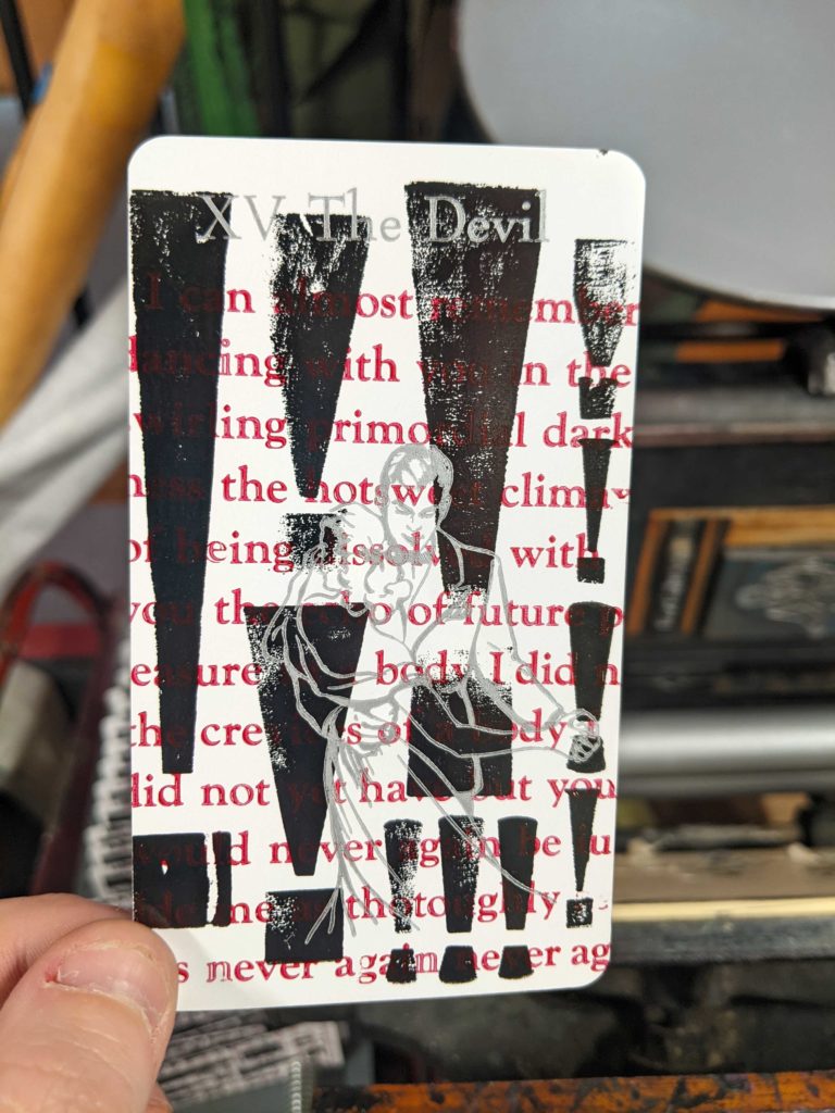
Also, the background—the black exclamation points—was originally meant to be the background of the Tower, but that card didn’t work out the way I was originally picturing it. So I had these extra cards already printed with this exclamation point background and I wanted to find another place to use them. I think that kind of artistic problem solving is really at the core of this project in a lot of ways, so the fact that the Devil came out so good really represents that to me.
What was your biggest takeaway from your residency with Book Arts?
It was really artistically empowering for me. I’m not an illustrator and that has always been kind of a point of insecurity for me within the artistic community, because most people draw and I don’t. It’s frustrating when other people can take an idea in their head and transfer it to paper with their hands, and I don’t have that skill. So that’s what has drawn me to mediums like collage and letterpress where you’re using something that already exists instead of creating something from nothing. I’ve struggled with imposter syndrome over the course of my life, and being able to complete such an ambitious project on this kind of scale during my residency and feel so good about the results is really validating in terms of thinking of myself as an artist.
The Tarot of Sorts will be on display at Book Arts in Buffalo, NY from March 18th through April 23rd, with an opening reception on March 18th from 5-8pm.