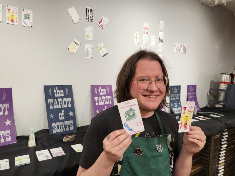
Making Old Things New Again: Jameson Hampton & the Tarot of Sorts
May 4, 2022 Jamey Alea 0 Comments
I like old things. Antiques. I like their vintage visual aesthetic and the way they smell. I like thinking about the people who used to use them. It makes me feel connected to the past to do things in the same way people used to to do them, to use the same tools people used to use.
This love of old things is what led me to letterpress printing. I have a soft spot for mediums that are considered “outdated” because I think it’s important to know our history and not lose these old pieces of the artistic process. I love everything about letterpress. In a world dominated by computers and screens, typesetting is delightfully tactile. The fact that it takes so long to lay out is a bit tedious, yes, but it also oozes with intentionality. You can’t make letterpress art by accident. Like a jigsaw puzzle, every piece has its rightful place.
Intention, of course, is also the building block of magic. And my love of tarot is also related to this love of old things, this connection I feel with every printmaker and tarot reader that has ever come before me. So for me, letterpress and tarot go together quite naturally, and thus the Tarot of Sorts was born.
Creatively, the challenge of this project was how to convey divinatory symbolism using only the assets I had available to me in the library of letterpress equipment at my print shop. Letterpress has always reminded me of collage in this way, which is another medium I’m very fond of—taking something that already exists and rearranging it to create new meaning. (Luckily, I was fortunate enough to have an extensive library to work with at my home studio, Book Arts in Buffalo, NY!) In letterpress, a “sort” refers to a single letter of movable type, so calling it the Tarot of Sorts alludes to the collage nature of the project, the way the deck can be broken down into these component pieces that it was made out of.
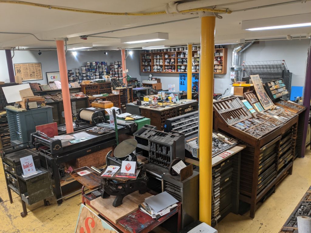
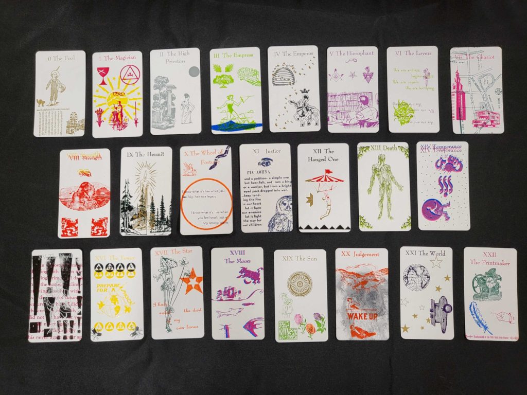
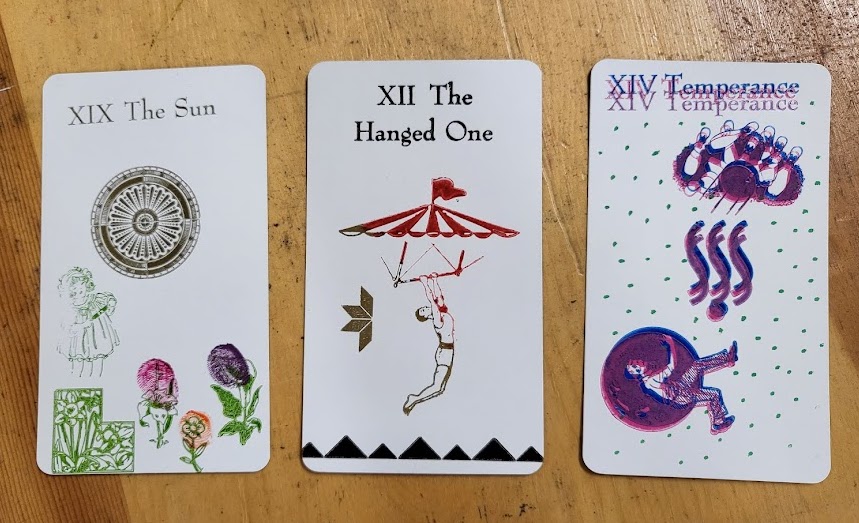
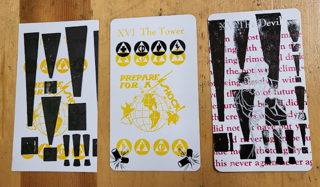
This is the kind of artistic challenge I love. They say constraints breed innovation, and what that looks like here is a breaking down of the traditional symbolism of the tarot into its barest parts to figure out interesting new ways to represent it. My favorite example of this in my deck is Temperance. Actually, I think the sport of bowling is a great metaphor for Temperance and its emphasis on patience, balance and flow, but I never would have come up with it if I hadn’t found some bowling themed forms as I was frustratedly scouring the library for ideas. The Tower is another good example, because you rarely see depictions of the Tower that don’t feature an actual tower of some sort! But I absolutely fell in love with this “prepare for a shock!” block, which has a delightfully vintage look and channels the exact energy I was looking for in the Tower.
Hand-printing a tarot deck came with a lot of logistical challenges as well, mainly in terms of the labor involved. Luckily, the process is fascinating! Let me walk you through what it was like to make a single card on this antique Chandler & Price platen press, which is the machine I used for the whole deck. (I printed directly onto blank tarot cards, and they were too small to use the larger Vandercook presses!)
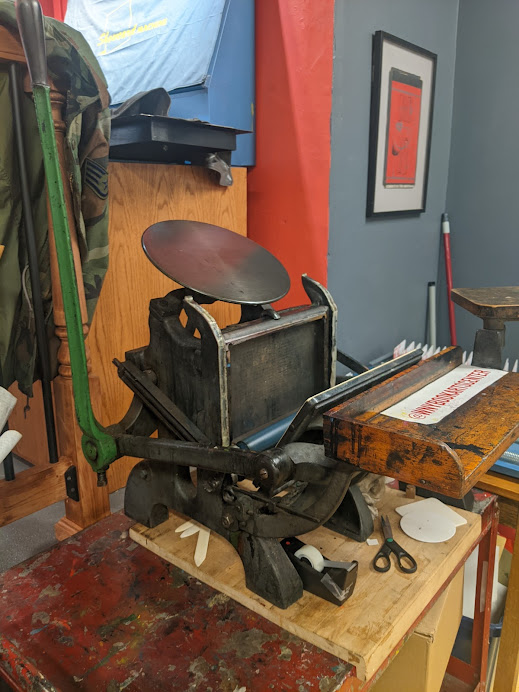
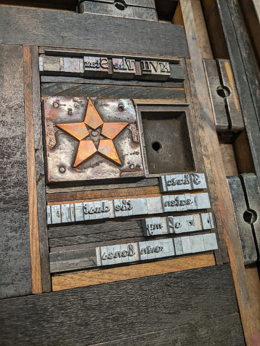
First, I designed what I wanted the card to look like and typeset it by hand. This is a laborious process, especially for cards that featured a lot of text, for a few reasons. The sorts are small and fiddly, and to load them into the platen press, they have to fit inside a metal frame (called a “chase”) extremely snugly, because the chase is inserted into the press vertically and if the sorts are loose at all, they could fall right out during this step! So all of the empty space has to be filled up with spacer pieces (called “furniture”) and then held in the chase with pressure by using “quoins,” which are spacer pieces that expand to lock everything in place. Also, the platen press can only print one color at a time, so this process has to be repeated for every different color that I want on a card!
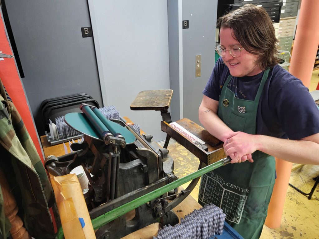
The ink goes on the circular plate, and then when you pull the lever down, the rollers roll up onto the ink, then down over the type to ink it, and then the panel that’s holding the card is pressed up against the type and it’s imprinted onto the card when they’re pressed together! I’ve pulled that lever at least 4,000 times so far working on this project!
Even though I had to work within a number of limitations, I tried to do some interesting things with the medium, which often meant just… trying stuff. Most of my experiments worked out pretty well! I got extra accent colors on the Sun by fingerprinting ink onto the cards. I achieved a color gradient on the Hanged One by using a manual proof press that had to be hand-inked between each card. I learned screenprinting just to add green dots to Temperance (which was probably overkill, but I did get to learn screenprinting)!
Other experiments were less successful, but having to readjust the plan when things didn’t work out was part of the constraints of the project, and in fact, led to the design of my favorite card: the Devil! I originally printed a background of black exclamation points, intending to use it for the background of the Tower, but it turned out that the yellow ink I used for the Tower wasn’t opaque enough to layer on top of black, so the whole design didn’t work out. But I worked hard on those exclamation points, darn it! So I incorporated them into a new design for the Devil, layered with red text and a silver outline of people dancing that looks ghostly and mysterious. This card is emblematic of my deck, I feel: visually interesting, incorporating both wooden and metal type and image forms, and never would have existed the way it does if it weren’t for creative constraints!
An exhibition of the full deck in the studio gallery at Book Arts is running from March 18th to April 23rd, since I completed it as part of their studio residency program. The end of the exhibition marks the beginning of the Kickstarter campaign, which is running with the intention of having reproduction copies of the deck made. Why? While the hand-printed copies are very cool, only about 35 copies of the full deck exist (and honestly it kind of hurts to say “only” when I hand-printed about a thousand cards)! Tarot is meant to be read from, and I want more than 35 people to be able to do readings from the cards I made. Reproduction decks, as well as original decks, singles of the original cards, and original, hand-printed posters, are available as Kickstarter rewards, as well as a few other surprises! Thanks for reading, as I really appreciate the interest in my process and the support for my project!
(This article was originally published at Little Red Tarot.)